


Tattoos are supposed to mean something. For some people, they represent memories, relationships, or personal milestones. But for others, they turn into permanent reminders of poor decisions, bad timing, or just terrible ideas. A tattoo can go wrong in many ways. Sometimes the artist messes up. Sometimes the design itself is the problem. And in many cases, it’s both.
What makes tattoo fails so fascinating is that they sit somewhere between regret and comedy. You can’t help but laugh, even though you know someone has to live with it forever. These examples show exactly how things can go completely off track when ink meets bad judgment.
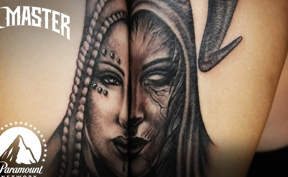
1. The Completely Botched Celebrity Portrait
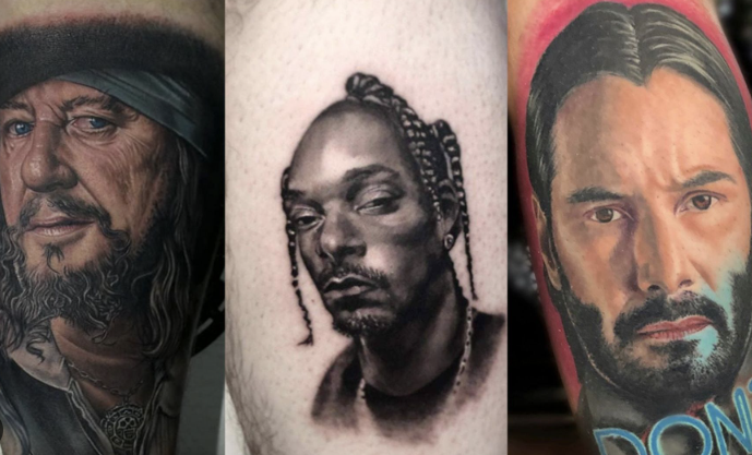
Portrait tattoos are one of the hardest styles to get right. When they fail, they fail badly. One of the most common victims is Marilyn Monroe, whose face has been turned into everything from distorted cartoons to unrecognizable blobs.
Instead of capturing her iconic features, these tattoos often exaggerate them in strange ways. Eyes are uneven, proportions are off, and shading makes the face look melted. What was supposed to be a tribute ends up looking like a horror version of the original. It’s a perfect example of why detailed tattoos require serious skill, not just confidence.
2. The Misspelled Tattoo Disaster
Few things are worse than a permanent spelling mistake. These tattoos usually start with a meaningful quote or phrase, but one small error completely ruins everything. Words are flipped, letters are missing, or entire sentences make no sense.
What makes it worse is how noticeable it is. Anyone who reads it immediately spots the mistake. There’s no hiding it, no fixing it easily, and no way to explain it without sounding careless. It turns something that was meant to be meaningful into something unintentionally funny.
3. The Food Obsession That Went Too Far
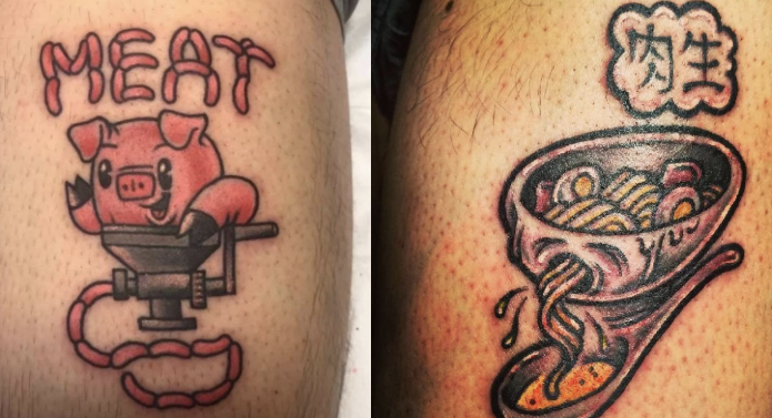
Liking food is normal. Tattooing your favorite meal onto your body is… questionable. Some people take it to another level by inking entire fast food orders, logos, or random food items onto their skin.
Instead of looking fun or unique, these tattoos often come off as confusing. A burger on your arm or a full meal list across your chest doesn’t really age well. What might feel funny in the moment quickly turns into something you have to explain for the rest of your life.
4. The Face Tattoo Regret
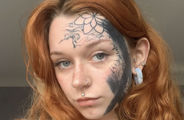
Face tattoos are already a bold choice. When they go wrong, they become impossible to ignore. Whether it’s random symbols, poorly drawn shapes, or designs that don’t fit the face at all, the result is usually overwhelming.
Unlike other tattoos, you can’t cover it up easily. It becomes the first thing people notice. When the design is bad, it turns into a constant reminder of a decision that probably wasn’t thought through properly.
5. The Pop Culture Gone Wrong
Pop culture tattoos can be great when done well, but they often miss the mark. Characters from shows like Game of Thrones or icons like Drake sometimes end up looking completely off.
Instead of recognizable figures, you get distorted versions that barely resemble the original. Fans go in expecting a tribute and come out with something that looks like a rushed sketch. It’s a reminder that not every reference translates well into tattoo form.
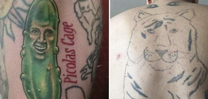
6. The Random “Why Would You Do This?” Design
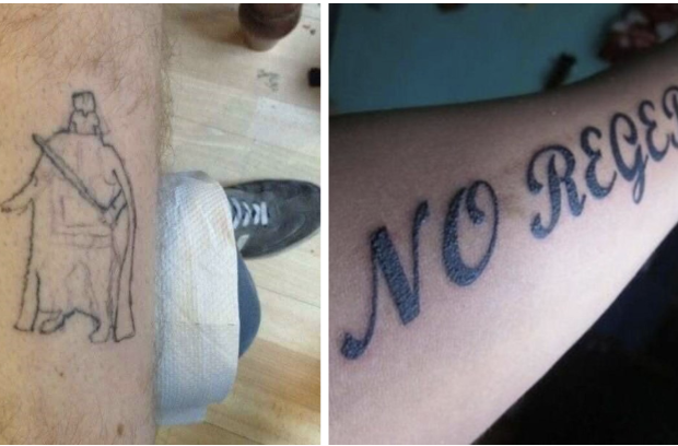
Some tattoos aren’t badly done; they’re just bad ideas. Things like random objects, awkward placements, or designs with no clear meaning fall into this category. A chair, a strange symbol, or something placed in a completely odd spot can leave people confused.
The issue here isn’t skill, it’s concept. Even a well-executed tattoo can look ridiculous if the idea behind it doesn’t make sense. These are the tattoos that make people stop and ask, “Why?”
7. The Finger Tattoo That Didn’t Survive
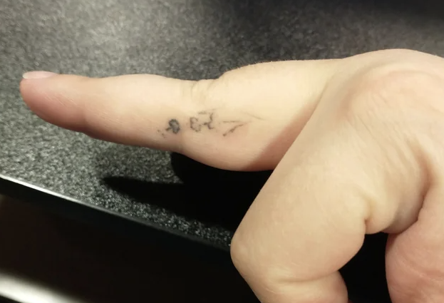
Finger tattoos look stylish at first, but they rarely hold up over time. The skin on the fingers fades ink quickly, so designs start to blur, break, and disappear unevenly.
What starts as a clean, sharp tattoo often turns into a smudged mess within months. Letters become unreadable, lines lose their shape, and the whole design looks worn out. It’s one of those ideas that seems great at first but doesn’t hold up in reality.